If you’re looking for a versatile tool to enhance your website’s engagement, this ConvertBox review is for you. As a loyal user since 2019, I rely on ConvertBox for all forms, popups, and banners on Wit & Wire’s website. In this review, I’ll explore what ConvertBox is, its key features, pros and cons, and how it measures up against competitors.
What is ConvertBox?
ConvertBox is a powerful lead generation and conversion optimization tool that allows you to create forms, popups, and banners to capture leads and engage with your website visitors. It offers a variety of customization options and integrates seamlessly with popular email marketing platforms, making it a valuable addition to any marketer’s toolkit.
My experience with ConvertBox
I’ve been using ConvertBox since 2019 for all the forms, popups, and banners on Wit & Wire’s website. Over the years, it has proven to be an essential tool in growing my email list and increasing user engagement. Its flexibility and ease of use make it a standout choice for anyone looking to boost their online conversions.
What can you create with ConvertBox?
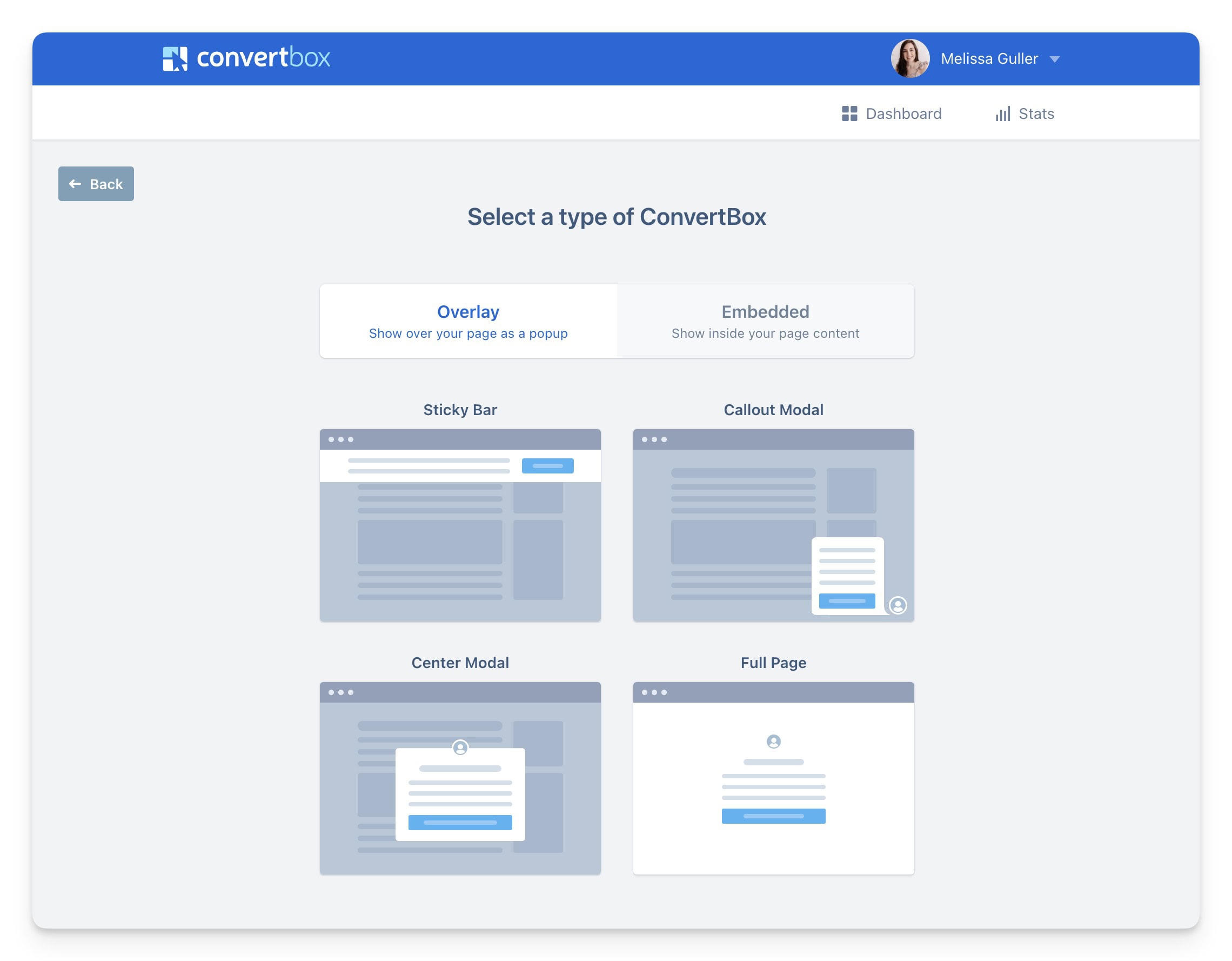
With ConvertBox, you can create a wide range of elements to engage your audience:
Popups
- Popups: These appear on top of your content and are great for capturing immediate attention.
- Banners: These are less intrusive and appear at the top or bottom of your page.
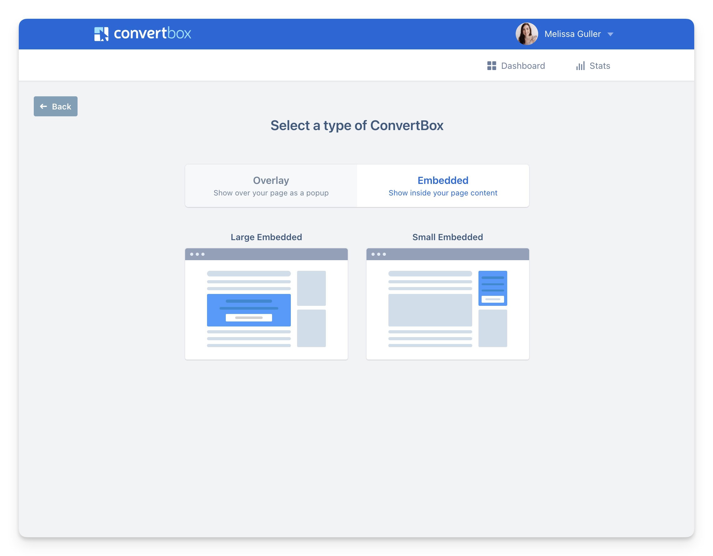
- Embedded Forms: These forms are placed directly within your content.
These elements can be grouped into two main types: overlays and embedded forms.
Overlays: Popups and banners that appear over your content, prompting immediate action.
Embedded Forms: Forms that are embedded within your content, allowing for a more seamless integration.
Pros and cons of ConvertBox
Like any tool, ConvertBox has its strengths and weaknesses. Here’s a breakdown [ConvertBox review]:
Pros:
- A/B Testing: Easily test different versions of your forms and popups to see what works best.
- User-Friendly: The interface is intuitive and easy to navigate, making it accessible even for beginners.
- Modern UI: ConvertBox’s design is sleek and modern, ensuring your forms and popups look professional.
- One-Time Lifetime Payment: Unlike many other tools that require a subscription, ConvertBox offers a one-time payment option, saving you money in the long run.
Cons:
- No Free Trial: ConvertBox doesn’t offer a free trial, but they do have a return policy if you’re not satisfied.
- A/B Testing Limitations: You can’t archive past A/B tests. Instead, you need to duplicate past ConvertBoxes and create new tests, which could be smoother.
Tips for maximizing ConvertBox
To get the most out of ConvertBox, consider these tips [ConvertBox review]:
Customize Your Design
Make Your Forms and Popups Cohesive
Take advantage of ConvertBox’s customization options to ensure your forms and popups match your brand’s aesthetic. A cohesive look will make your site appear more professional and trustworthy. Customize colors, fonts, and images to align with your brand identity. Consistent branding helps build trust and recognition among your audience, making them more likely to engage with your forms.
Utilize A/B Testing
Optimize Performance Through Testing
Regularly test different variations of your forms and popups to optimize their performance. Small changes in design, copy, or timing can significantly impact conversion rates. For example, test different headlines, button texts, and images to see which combination yields the highest conversions. ConvertBox’s A/B testing feature allows you to run these experiments seamlessly, helping you identify the most effective elements for your audience.
Segment Your Audience
Target Specific Groups with Personalized Messages
Use ConvertBox’s segmentation features to target specific groups of visitors with personalized messages. This can help increase engagement and conversion rates. Segment your audience based on behaviors, such as pages visited, time spent on site, or previous interactions. By delivering tailored content, you can address the unique needs and interests of different audience segments, leading to higher relevance and better results.
Monitor Performance
Track and Analyze Your Results
Keep an eye on the analytics provided by ConvertBox to understand how your forms and popups are performing. Use this data to make informed decisions about adjustments and improvements. Track metrics such as views, conversions, and conversion rates. Regularly review this data to identify trends and areas for enhancement. For instance, if a particular popup has a low conversion rate, you might need to adjust the timing, design, or messaging.
Integrate with Other Tools
Enhance Functionality with Integrations
ConvertBox integrates with various email marketing platforms and CRM systems. Leverage these integrations to streamline your workflow and ensure seamless data transfer between tools. For example, automatically add new subscribers to your email list or CRM, and trigger automated email sequences based on user interactions with your forms.
Use Exit-Intent Popups
Capture Leaving Visitors
Implement exit-intent popups to capture the attention of visitors who are about to leave your site. Offer a compelling reason for them to stay, such as a discount code, free resource, or special offer. Exit-intent popups can help reduce bounce rates and recover potential leads that might otherwise be lost.
Experiment with Different Triggers
Find the Optimal Timing
ConvertBox allows you to set various triggers for your forms and popups, such as time on page, scroll depth, or click actions. Experiment with different triggers to find the optimal timing for displaying your messages. For instance, a popup triggered by a user scrolling 50% down the page might perform better than one shown after a few seconds on the site.
Personalize Your Messaging
Address Users by Name
If you have information about your visitors, such as their names or previous interactions, use this data to personalize your messaging. Personalized messages can create a stronger connection with your audience and improve conversion rates. For example, addressing a visitor by their name in a popup can make the interaction feel more tailored and engaging.
Keep Your Forms Simple
Reduce Friction for Users
Ensure that your forms are easy to complete by keeping them simple and concise. Only ask for essential information to minimize friction and increase the likelihood of conversions. Long and complex forms can deter users from completing them. Focus on capturing the most critical information, such as an email address, and consider asking for additional details later in the user journey.
By implementing these tips, you can maximize the effectiveness of ConvertBox and achieve better results in your conversion efforts. Regularly reviewing and optimizing your forms and popups will help you stay ahead and continuously improve your performance.
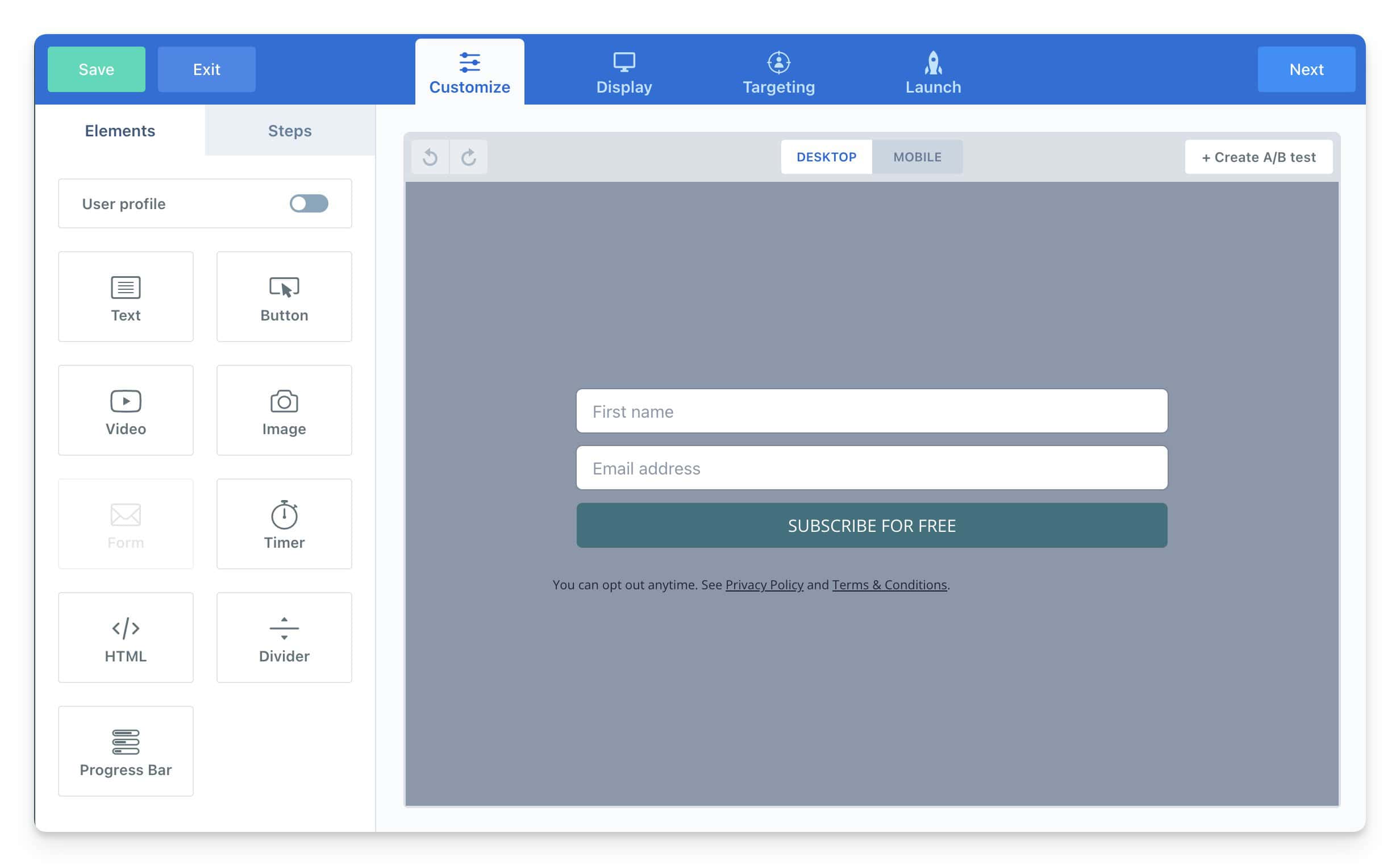
Here’s an example of an Embed form for my website:
Final thoughts
ConvertBox is a versatile and powerful tool for anyone looking to enhance their website’s engagement and lead generation efforts. Its user-friendly interface, modern design, and robust features make it a standout choice for creating forms, popups, and banners. While it has some limitations, its benefits far outweigh the drawbacks, especially with the one-time lifetime payment option.
If you’re serious about growing your email list and increasing user engagement, ConvertBox is definitely worth considering. I hope this ConvertBox review has helped your decision making process.
Ready to see ConvertBox in action? Click here for all the details
